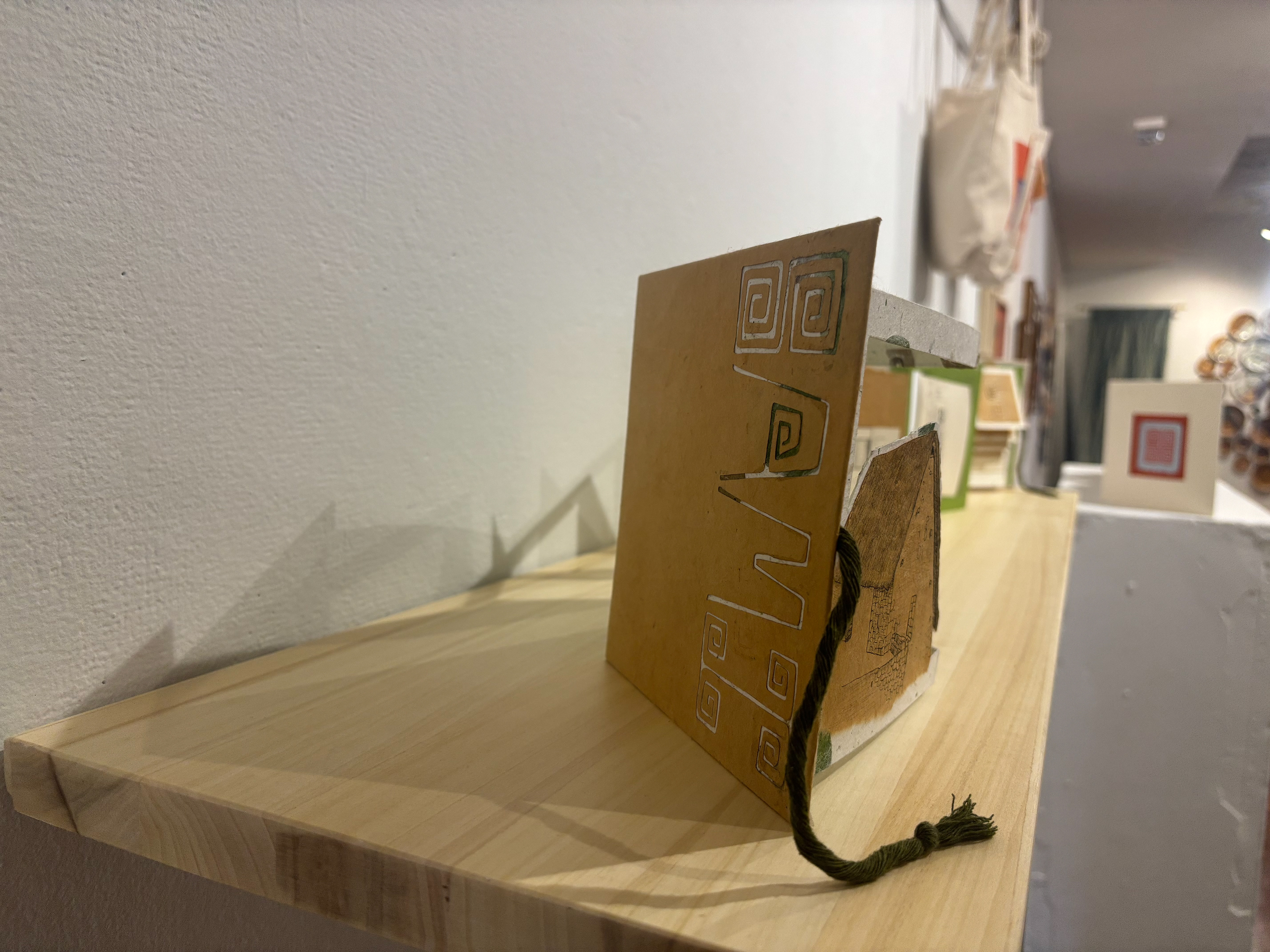
Sami: Type Design & Visual Exploration Zine
The development of Sami began with research into Peruvian visual culture, including the trapezoidal forms of Inca architecture, ancient pottery, and contemporary Peruvian design. Inspired by the structural resilience of Inca architecture and the meaning of Sinchi, a Quechua word associated with strength, I translated these references into the letterforms of a custom typeface for Sinchi, a bohemian boutique inspired by Peruvian culture.
I explored the letterforms through sketches and hands-on printing techniques, including potato printing a nod to Peru’s remarkable diversity of potato varieties and linocut printing.


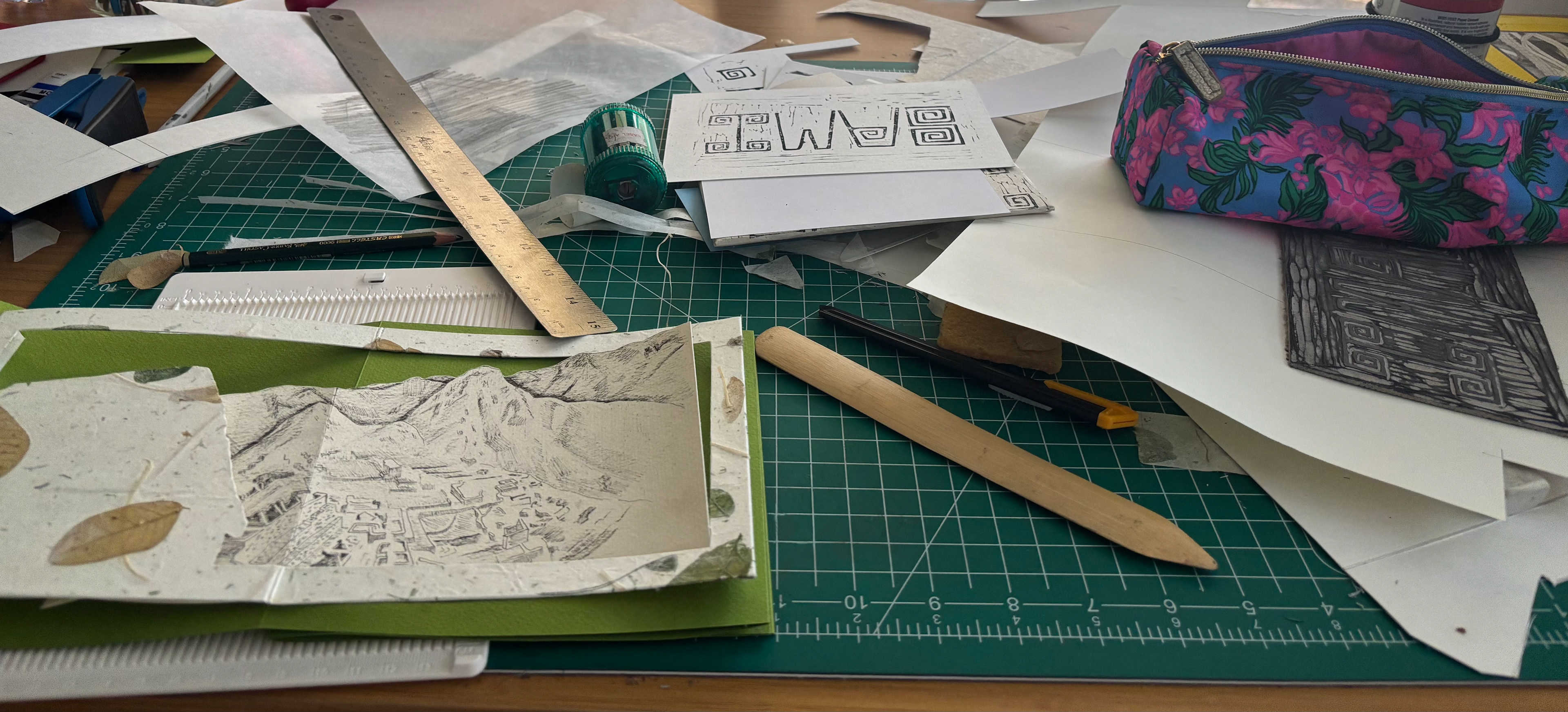


The final Sami typeface translates these cultural and architectural influences into a cohesive typographic system for Sinchi. I presented the process and resulting letterforms in an accordion zine, using natural paper and an earthy color palette to reinforce the brand’s handcrafted aesthetic and connect the typography to the visual identity.